
Restyling ✴ MAGMAMEMORIA
MAGMAMEMORIA is the name the artist gave to his NOSTALGIA, a memory that burns inside her.
To redesign the album's visual identity, I started with an in-depth analysis of the music's tone and themes.
The design process included exploring various concepts for the album cover, experimenting with typography, color schemes, and imagery to create a cohesive and modern visual language.
MAGMAMEMORIA
✸ ✸ ✸ ✸ ✸


2022
Challenge
Redesigning the visual identity of an existing album.
The goal was to reimagine the album cover, packaging, and overall aesthetic while maintaining the essence of the music and its themes, exploring innovative approaches, incorporating elements such as typography, color theory, imagery, and symbolism.
Results
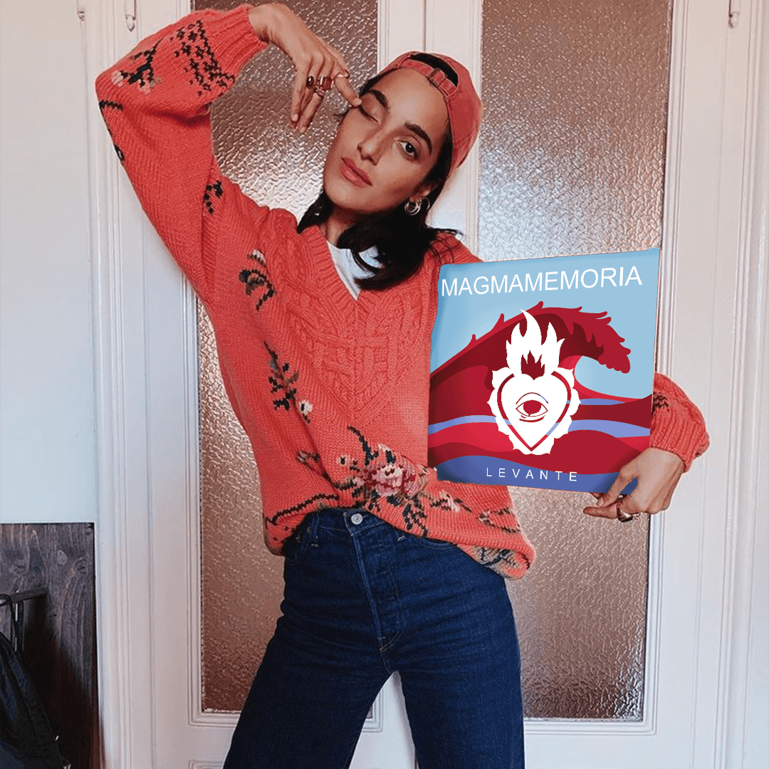
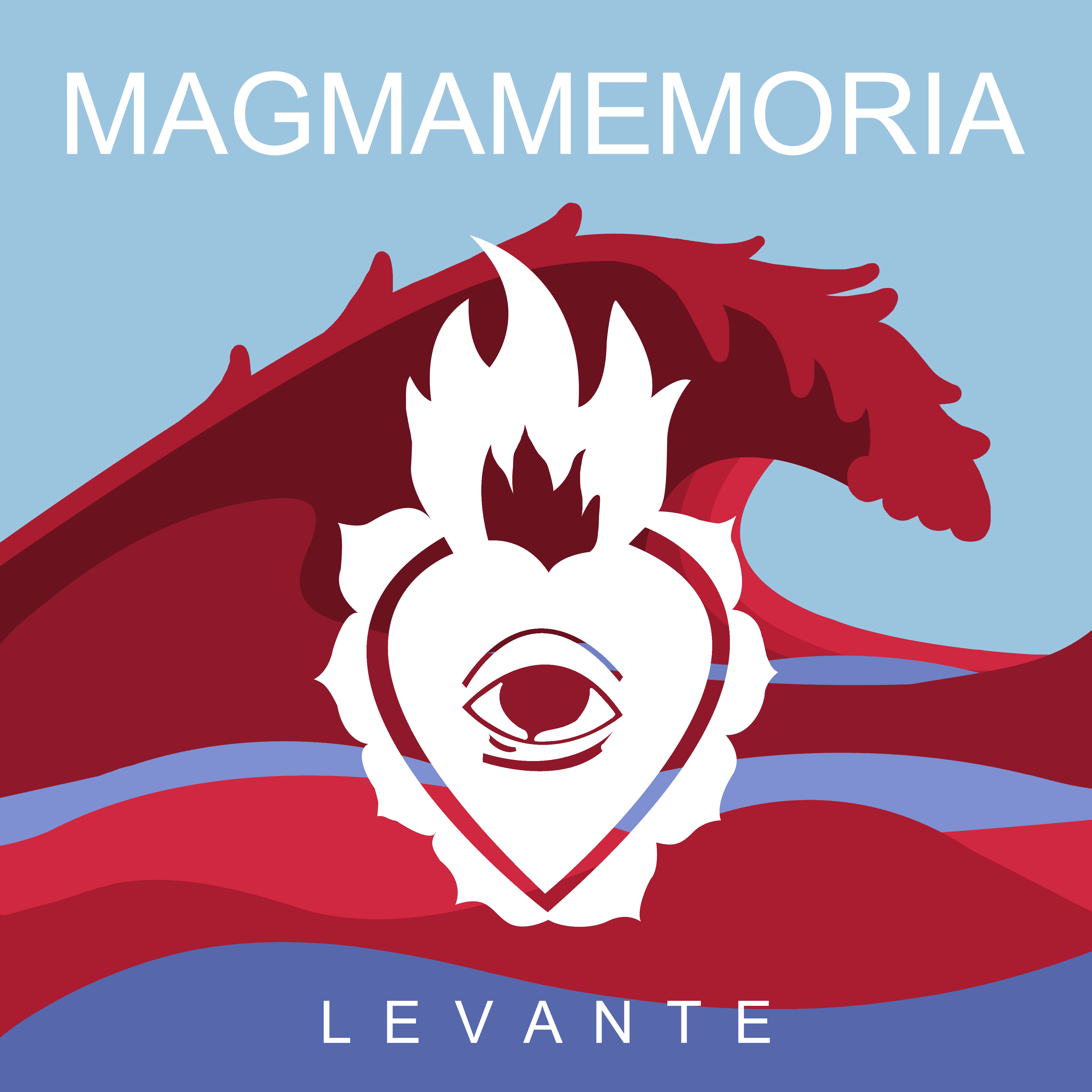
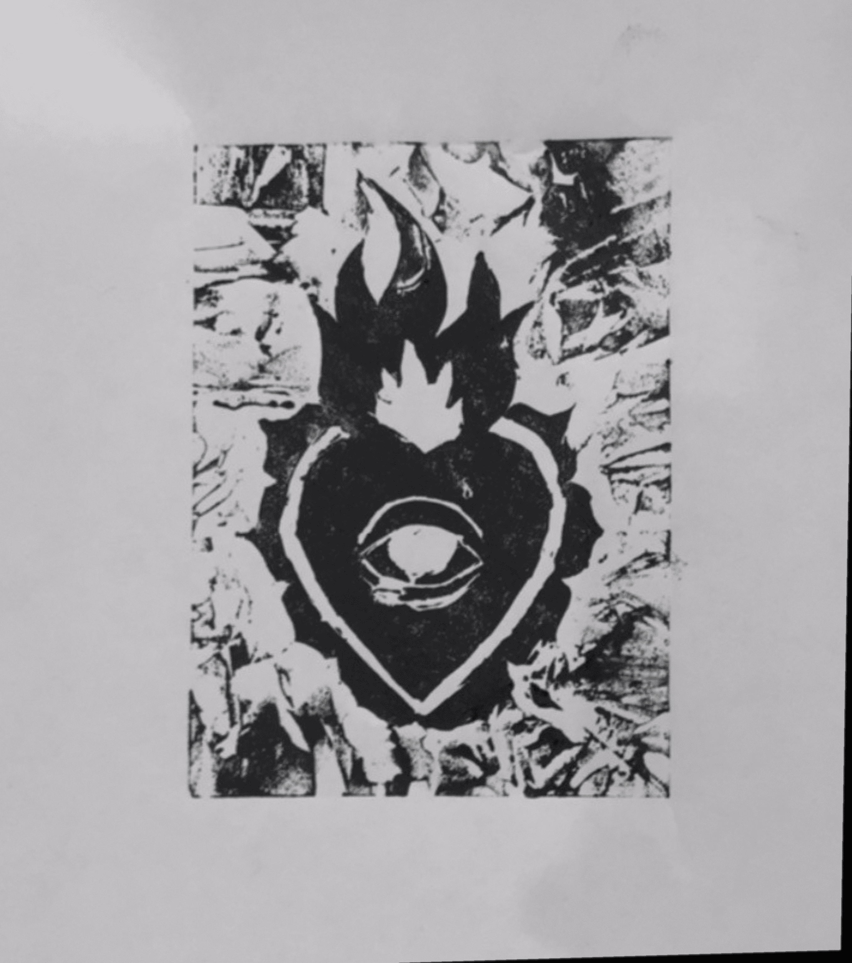
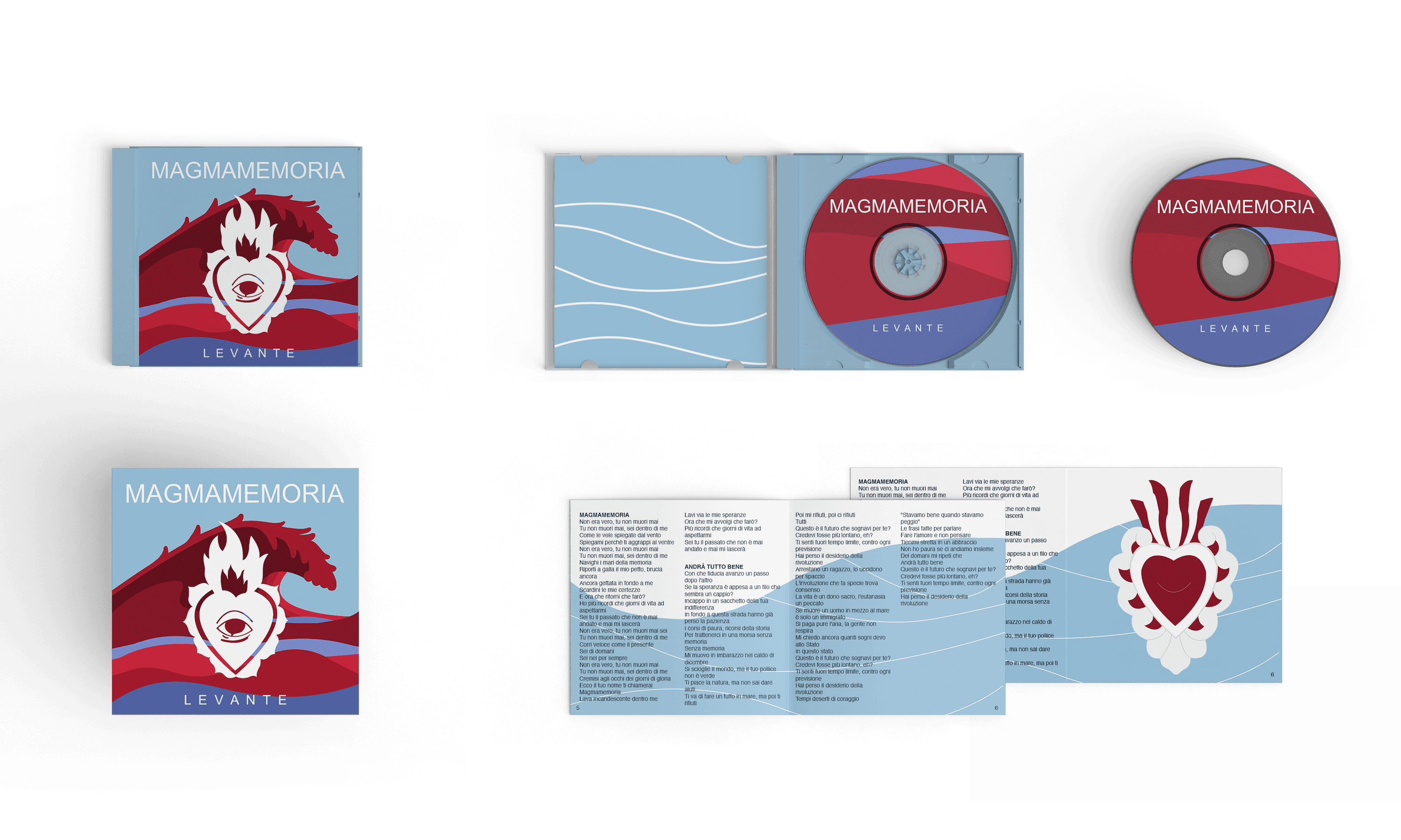
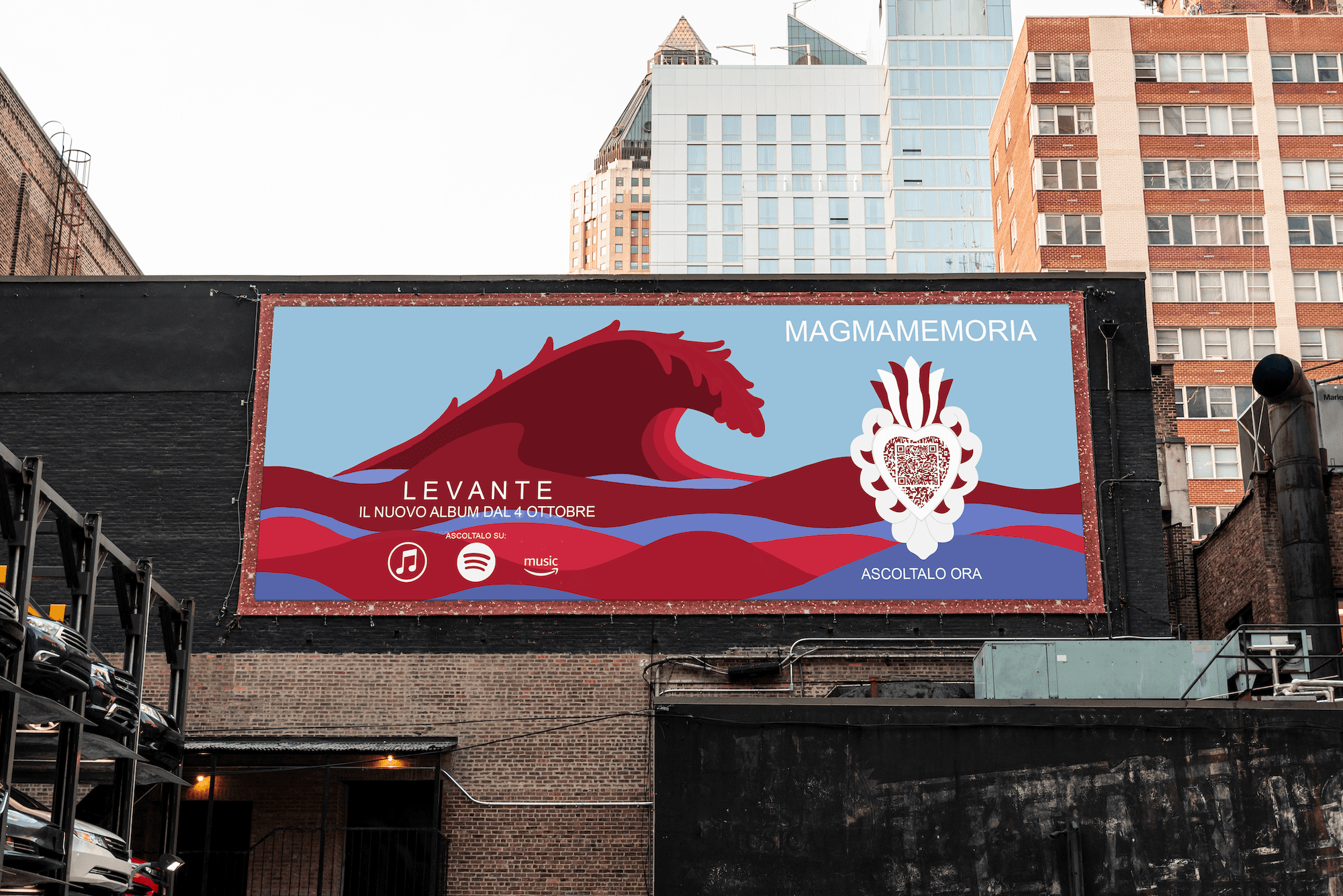
The main aspect of the original album is the use of the color red, which almost completely surrounds the artist. To better express the concepts, on the front of the album there is a graphic heart in the foreground, "protagonist" of the cover, so as to immediately let the emotional aspects that the artist wants to show through in her album emerge. The heart comes from a stencil I made in linocut, using linoleum and ink.
The whole thing is emphasized by the background where there is a stormy sea made of lava (magmatic memory) and water (the artist's tears), which represents the emotional whirlwind and the magmatic state of the memory of the past, as the artist described.
Process
Research & Analysis: I listened to Magmamemoria to understand its mood, themes, and emotional depth. Research included studying album covers with similar concepts and exploring visual styles related to memory and transformation. The goal was to extract key elements like volcanic energy, nostalgia, and surrealism to guide the design.
Developing and Moodboarding: I gathered visual references, including volcanic imagery, abstract memory representations, and typography experiments. A moodboard helped define the artistic direction, balancing dreamlike aesthetics with bold, fiery elements. Early concept sketches explored how these ideas could merge into a cohesive design.
Sketching & Prototyping: I created rough compositions, testing different layouts for the main elements: volcano, fragmented memories, and a walking figure. Quick sketches allowed me to experiment with symbolism and movement before committing to a digital design. These low-fidelity drafts helped refine the core visual narrative.
Visual Design: The final digital design was created with a bold, graphic 2D aesthetic, using a limited but impactful color palette. I placed the hearth at the center to symbolize the emotions and memories, especially with the eye in the middle.
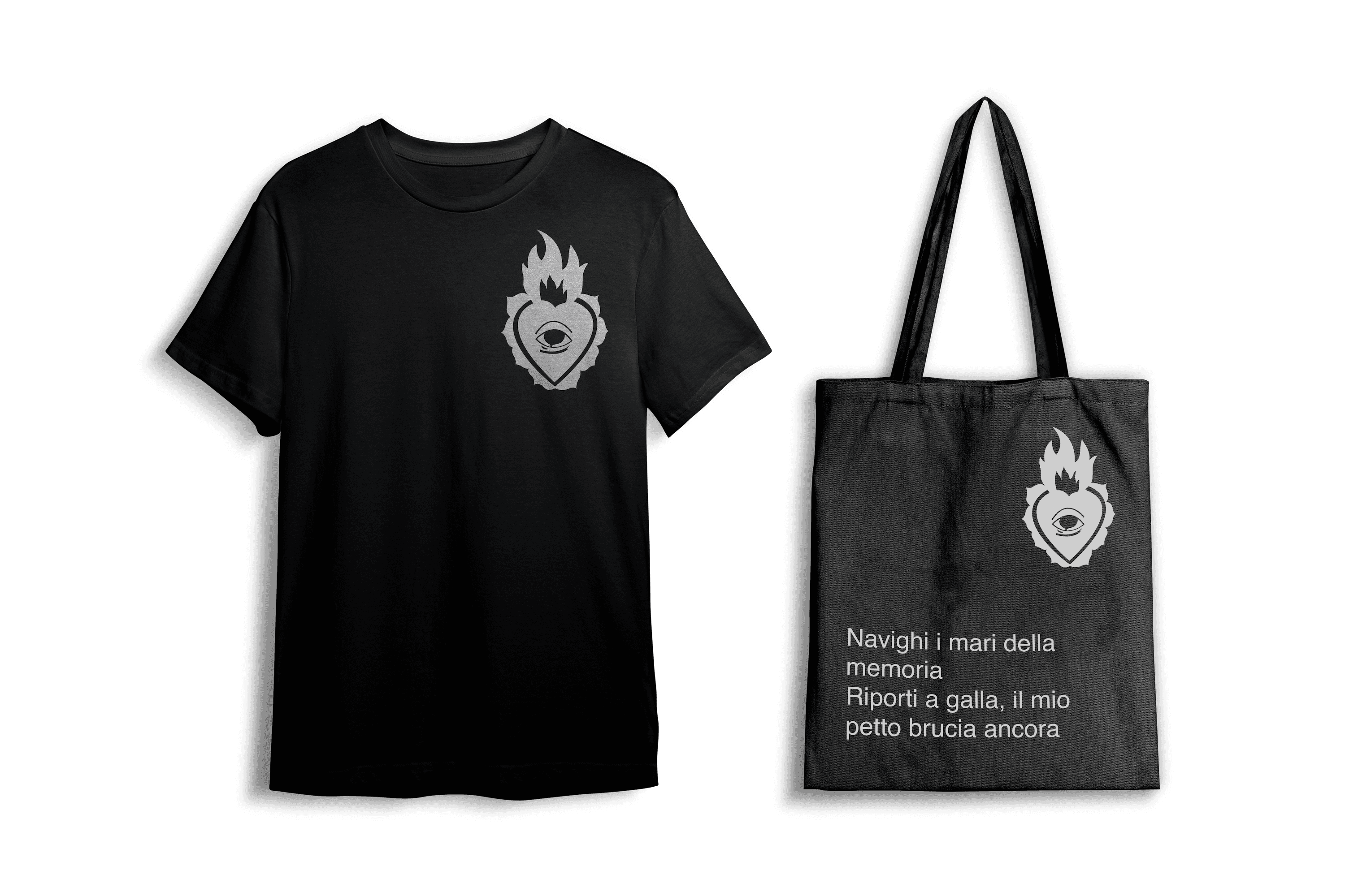
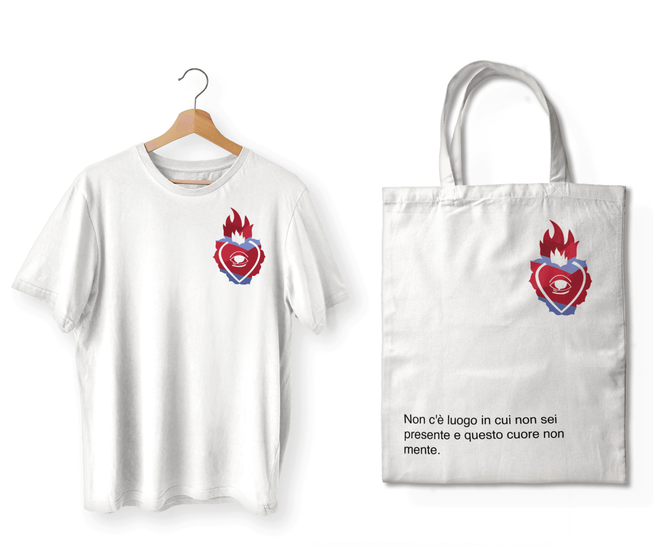
Style Guide: The final artwork was exported in multiple formats to suit print, vinyl, and digital streaming needs. A cohesive style guide was created to maintain consistency across promotional materials and merchandise.
Here the mockups, merchandising and one of the billboard with the QR code to listen to the album.
Conclusion
In conclusion, this album restyling project has successfully reimagined the visual identity of the original album, transforming it into a fresh and modern representation that resonates with both the essence of the music and the evolving preferences of contemporary audiences.